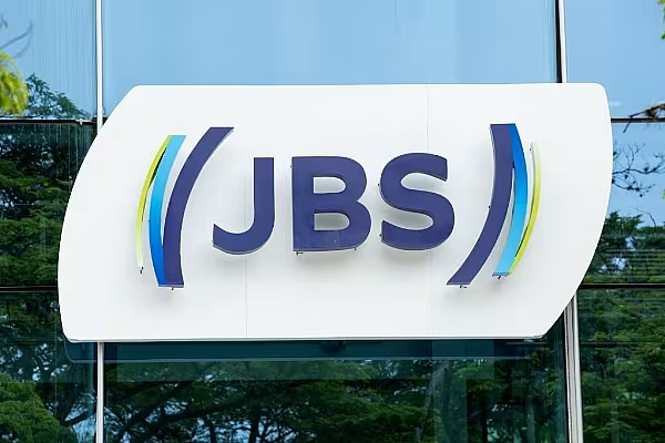
Brazilian food giant JBS has unveiled a new brand logo, to mark its 70th anniversary.
The company has rolled out the new branding at its headquarters in São Paulo and will extend it to various units in Brazil and around the world, it noted in a statement.
Various JBS product lines in different countries have started to incorporate the new brand identity, the company added.
JBS teamed up with FutureBrand for the new visual identity, which took around three years to develop.
Gilberto Tomazoni, global CEO of JBS, stated, “We started from a small meat house in the interior of Brazil and became one of the largest food companies in the world. We are a multi-protein and multi-geographic company, with more than 270,000 employees, in more than 20 countries. We have evolved a lot, especially in the last decade, so it is natural that our brand evolves, too.”
Brand Design
The new design features the traditional three letters of the company’s name in a modernised form.
Parentheses around the letters represent protection and affection between the company, clients and consumers.
The letters J, B and S and the beginning of the parentheses feature a solid blue tone, which represents the company’s robustness.
The other shades of blue symbolise the various protein categories offered by the company and the geographies in which it is present.
Green represents the company’s commitment to environmental, social, operational and economic sustainability.
“We decided that the colours would represent our commitment to our culture and values, our social and environmental responsibility, and the eternal search for excellence in everything we do,” added Tomazoni.
