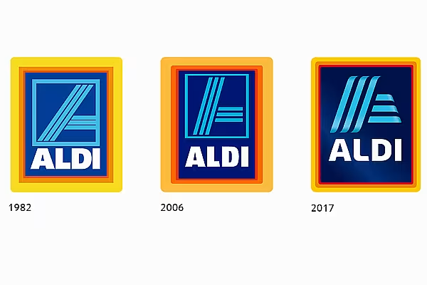
Aldi Süd has unveiled a new logo, which the discounter says 'reflects the significant developments that the company in recent times'.
The new logo, which will be rolled out across the retailer's various markets from this June, retains the same blue background and yellow, orange and red border, however the Aldi 'A' now features with more of a 'wave' design, and the font used for the word 'Aldi' has also changed.
"For our customers, this is reflected by the ongoing development of our product range, redesigning our branches or actions as the next pop-up store, 'My Wine World'," says Kirsten Gess, Communication Director, Aldi Süd.
"The fresh visual design of the new logo is ideal for the current process of modernisation of Aldi Süd."
The logo has already been launched in China, where from March 20th, selected Aldi products that go on sale on the Tmall online marketplace will feature the new branding.
Several Changes
It's not the first time the Aldi logo has been redesigned, with the Aldi logo of today differing greatly from the 'Albrecht' logo when the brand was founded in 1948. The last time the logo was redesigned was in 2006.
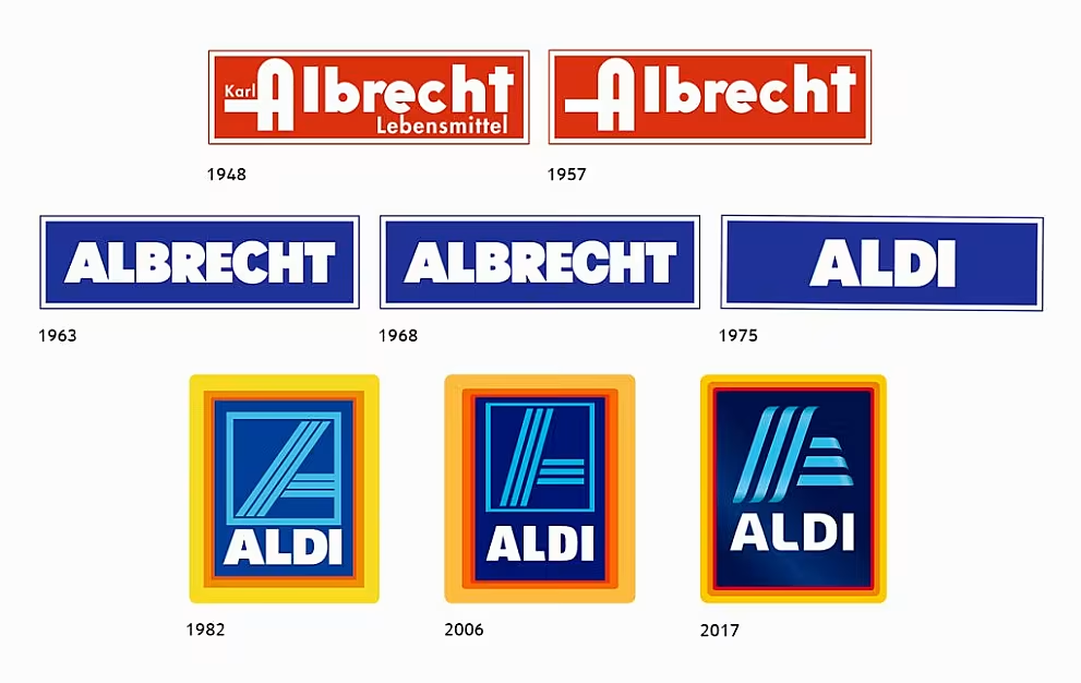
The Austrian arm of Aldi, Hofer, is also set to receive a new logo as part of the rebrand. All pictures copyright of Aldi Süd.
© 2017 European Supermarket Magazine – your source for the latest retail news. Article by Stephen Wynne-Jones. Click subscribe to sign up to ESM: The European Supermarket Magazine.
