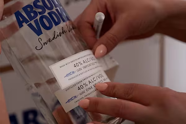
Iconic Swedish vodka brand Absolut has unveiled its first major design refresh since the brand was created in 1979, with the Pernod Ricard owned brand teaming up with Brand Union, Destrito and Ardagh Group on the upgraded design.
The bottle maintains its shape, which was originally inspired by an 18th century apothecary bottle, however the brand's medallion and quality seal have been updated, and the script used on the front of the bottle has been made more legible.
In addition, an illustration of the original Absolut distillery also features, while the words 'Country of Sweden' are now embossed on the glass.
Capturing The Story
"We were keen to capture our rich, quality story and make that clearer on the bottle, signposting to what makes our vodka unique," commented Elin Furelid, global head of product portfolio and design, Absolut.
"We have of course kept the most important design elements that makes Absolut, Absolut.”
Biggest Design Challenge
Commenting on the embossing of the 'Country of Sweden' ident, Maria Persson, NPD project manager, Ardagh Glass Packaging Europe, said that this represented the biggest design challenge on the new bottle.
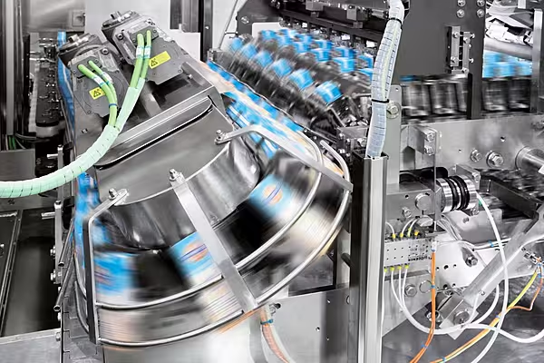
“The embossed wording ‘Country of Sweden’ stands proud from the surface of the bottle, so we had to consider how to design it in a way that would protect it from contact with other bottles on the production line," she said.
“After several different designs, the agreed way forward was to create a ‘dip’ around the embossed wording, which allows it to sit flush with the side of the bottle, thus preventing it from being a contact point and ensuring a smooth production run.”
Elsewhere, Charl Bassil, global vice president, Marketing – Absolut, said that the new design helps to communicate the brand's "provenance, heritage and authenticity more clearly than ever before".
© 2021 European Supermarket Magazine – your source for the latest Packaging news. Article by Stephen Wynne-Jones. Click subscribe to sign up to ESM: The European Supermarket Magazine.
