In the immediate aftermath of the UK referendum, press headlines have been occupied with tales about retailer sales dips, staggering drops in consumer confidence – which has seen its biggest dip in 21 years – and short-term rises in the cost of food and drink.
In a landscape rife with uncertainty, it’s all too easy to revert to panic mode, says Sonia Whiteley-Guest, group commercial director at Sun Branding Solutions.
"Actually, it’s worth reminding ourselves that consumers purchase millions of products a year. This fundamentally won’t change - as evidenced by recent figures from Barclaycard, which show spending growth remaining at 3.6% in May and June."
While retailers and brands are investing heavily – both time and money – in understanding our shopping lifecycles and purchase decisions, it is also worth taking stock of which triggers being focused on.
"Monitoring habits like basket abandonment, product research and brand cut-through via your advertising communications have their place, but there’s another, more subtle, and arguably often over-looked driver: colour," she says.
"Retailers are well aware that we unconsciously recognise visual cues. We’re programmed to look for shapes and – in particular – colours.
"It’s an integral part of our decision-making process, reliant more on what behavioural economists refer to as heuristics – mental shortcuts that ease the cognitive load of making a decision – and what the rest of us put down to gut instinct."
Humans are emotive beasts who respond to mental shortcuts, guesses and semantic influence. Unsurprisingly, colour is a deeply embedded element of our communication lexicon.
"It is so vital to our understanding of the world, and our decision-making process, that even seemingly indiscernible variations subconsciously sway us one way or another."
In fact, research has found that 92.6 per cent of people put most weight on visual factors when purchasing – and 84.7 per cent said that colour was a primary reason they chose certain products. We tend to shop by location first, then colour and shape, and only lastly by brand - if at all.
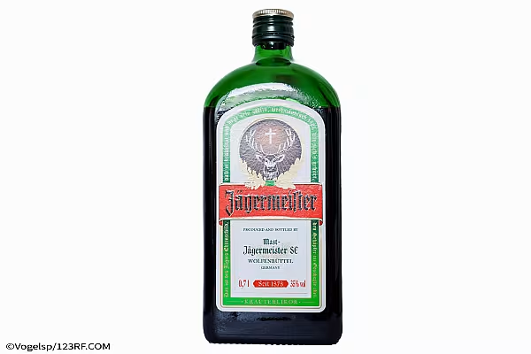
"It’s why brands go to great lengths to protect a particular shade such as purple - the notable case of Cadbury and Nestlé’s five-year battle."
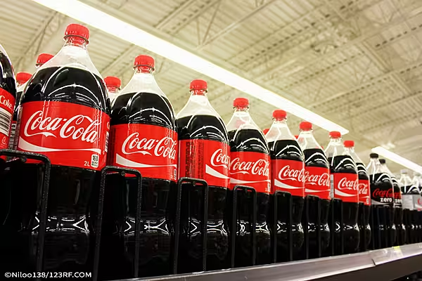
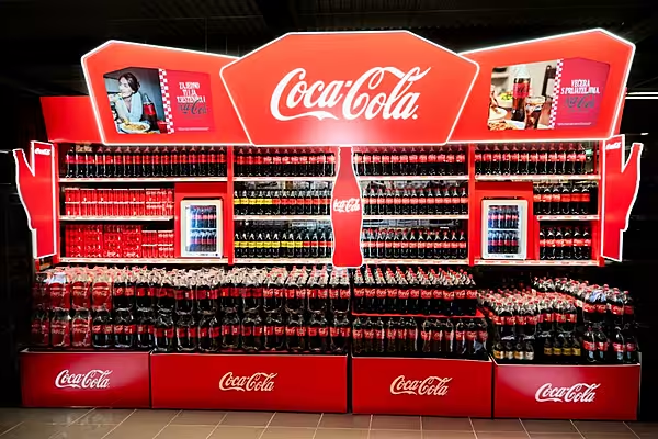
There’s an even greater reason for this. If we can’t find the iconic red cans we’re looking for in the soft drinks aisle, it can disrupt the shopper journey to the point where we buy something else or leave empty-handed.
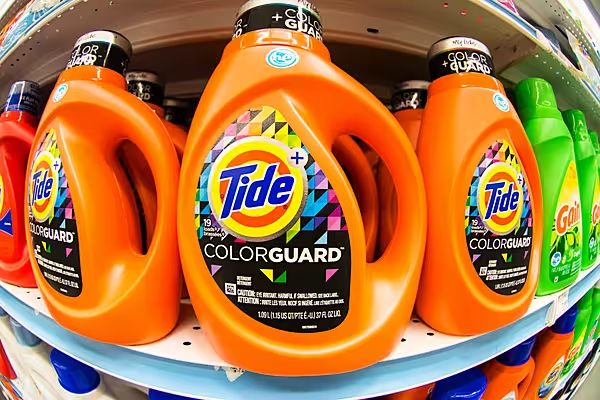
"In some low-interest categories like washing-up liquid, where people don’t tend to linger, brands have even lost sales because they’ve changed their packaging shape and brand colour.
"Take Tropicana, whose product redesign saw sales drop by 20 per cent, losing the company millions because it was changed so heavily, including the dulling of the vibrant orange colour on-pack, a key visual cue."
This is why colour consistency is so important, she argues. If that iconic green looks different to shoppers because it was printed differently, they might not buy it at all. You want shoppers to unconsciously recognise your brand colour whether it’s on a refill pouch, a bottle or a cardboard box.
Never has this been more important than in today’s world of digital shopping. Watch any eye-tracking video of a shopper online grocery shopping, and you’ll see them scrolling rapidly through multiple items.
"We are reliant on our instant recognition of the colour or iconic shape of our preferred brand to slow us down and make it into our baskets.
"If we don’t see it, we simply scroll past. And when we select 100 items in 45 minutes from the supermarket shelves laden with over 20,000 SKU’s, you can see why the human brain looks for shortcuts to reassure us that we have picked the right thing.
So seek to reassure, especially in times of uncertainty. The smallest changes can sometimes make the biggest differences, and not always for the best, she concludes.
© 2016 European Supermarket Magazine – your source for the latest retail news. To subscribe to ESM: The European Supermarket Magazine, click here.
