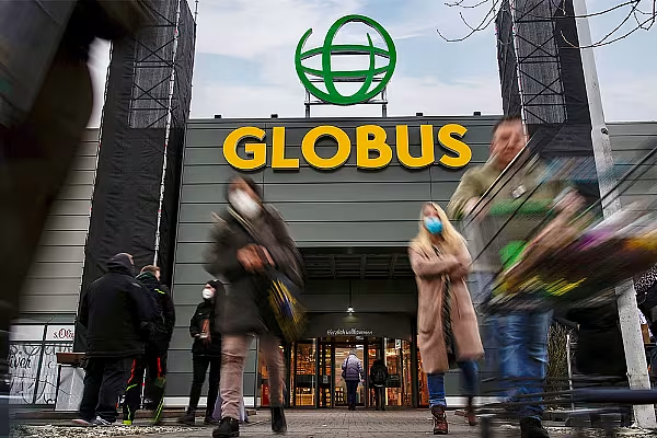
German retailer Globus has launched a new corporate design and logo, which it says will convey modernity and transparency.
Managing directors, Matthias Bruch and Jochen Baab, officially unveiled the new logo at the entrance to the Globus market hall in Maintal.
The retailer aims to roll out the new look at all market halls by the end of this year.
'Modern Appearance'
Baab commented, "With our new modern appearance, we want to underline our services and competencies even more and express our orientation: Selected variety, really well-made products, services and experiences."
As part of the new look, the company has retained its traditional green and orange colours, with an expanded colour palette.
The logo features a dynamic globe and the lettering is in rounded uppercase.
The new corporate design includes new colours, shapes, images and fonts, and will apply to all areas of its stores - from the small price tags on the shelf to the large advertising posters.
Bruch added, “Our company has grown location by location. And because each of our stores is a tailor-made suit for the respective location, region and time, each of our stores also looks a little different: with logos from different years and different store designs.
“The realignment of our image offers us the opportunity to modernise our brand holistically and comprehensively and thus support our growth course."
Brand Realignment
Globus has been working on brand realignment and strategic development in e-commerce, customer loyalty, and customer services for more than a year.
At the beginning of January, the company changed its name from Globus SB-Warenhaus Holding to Globus Markthallen Holding as part of its transformation from classic self-service department stores to modern market halls.
Read More: Globus Teams Up With Lieferando For Food Delivery In Koblenz
© 2022 European Supermarket Magazine – your source for the latest Retail news. Article by Dayeeta Das. Click subscribe to sign up to ESM: The European Supermarket Magazine.
