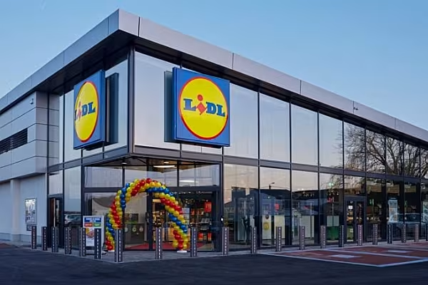
German supermarket chain Lidl is simplifying its store concept in Belgium to ensure that all 310 outlets eventually have the same design and layout, according to media reports.
After years of modernisation and store upgrades, Lidl Belgium now wants to return to the so-called traditional 'no-frills' concept.
The banner has to compete with the higher growth rate of its rival Aldi in the country, and changing the layout of its stores can be a good move.
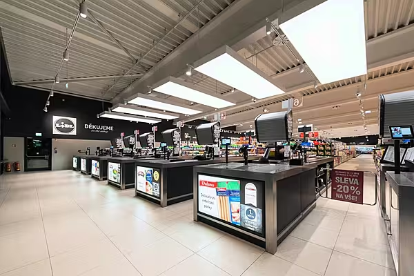
Lidl is implementing a similar project across the border, in Germany, where it has opted for a 'no-frills' concept, based on simple and sober interiors, closer to the hard discount model, with express promotions and more self-checkouts to attract price-conscious customers.
'Recognise A Lidl'
"Lidl implements its own concept in each market. In Germany, the design is being adapted to the German market. The aim is for customers to recognise a Lidl when they enter.[...] In concrete terms, you will encounter the bakery, fruit, and vegetable department first when you enter the store," Isabelle Colbrandt, spokesperson for Lidl Belgium, told Flemish daily Het Laatste Nieuws.
She highlighted that the changes will not only make Lidl more distinguishable for customers, but also increase efficiency among the staff.
"There are currently many different variants between our locations, which means there are many different operational tasks per store. By moving to one clear store concept across all stores - also in terms of logistics, transport, deliveries, etc. - it also becomes easier and more efficient for our staff," Colbrandt added.
Read More: Top 10 Supermarket Retail Chains In Belgium


